My Ride Status Redesign
Product Design · B2C · Mobility

Overview
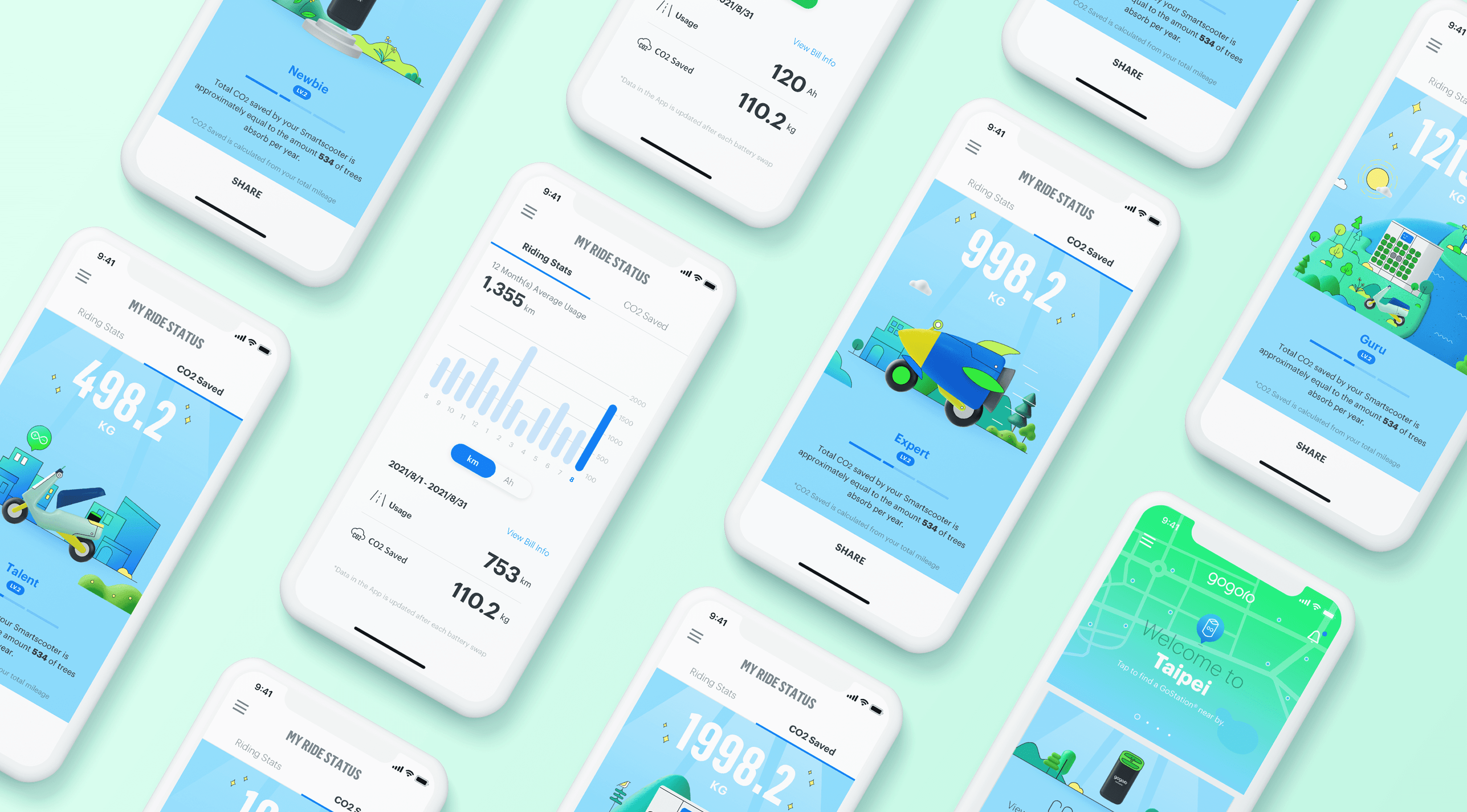
My Ride Status is a core app feature that helps Gogoro riders understand their riding habits, summarising monthly stats like mileage, energy usage, and CO₂ reduction in one place. In 2021, I redesigned the interface to address long-standing complaints about unclear visuals and limited insights. By simplifying the display and introducing new behaviours like plan tracking and billing access previously hard to find, the update made ride data feel more useful and engaging—while encouraging habits that support Gogoro’s sustainable energy network.
Role
Product Design, Wireframing, Prototyping, Testing, Design Review, Visual Design
Team
Solo Designer, 2 Product Owners, 1 Project Manager, 4+ Engineers
Timeline
Aug 2021 — Oct 2021
Background
Gogoro is a Taiwan-based company that designs smart electric scooters (Smartscooter) and operates a battery-swapping network used by millions of riders. Through the Gogoro App, users can access features like vehicle diagnostics, battery monitoring, personalised settings, and more.
Within the app, My Ride Status had long been one of the most frequently revisited pages, helping riders review monthly performance and reflect on riding history. However, the feature hadn’t been updated since 2017. Its circular graphs were hard to interpret, and the lack of contextual information made it difficult to extract meaningful insights. Complaints surfaced across rider communities and support channels, prompting the team to prioritise a redesign.
Discovery
User Feedback Analysis
To uncover recurring complaints, I reviewed user discussions from Facebook groups, community forums, customer support channels, and app reviews. I collaborated with product owners to collect over 65 responses. Common issues surfaced from our analysis: riders felt the available data lacked depth, the visuals were confusing, and accessing key information (such as billing or historical mileage) required navigating through multiple, unrelated sections. These insights became the foundation for a deeper audit of the original interface.
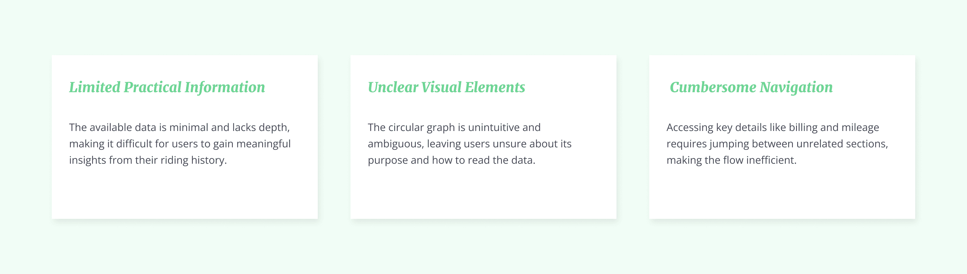
UI Audit & Problem Mapping
To validate the issues raised by users, I conducted a detailed audit of the existing My Ride Status interface, reviewing its layout, content structure, and interaction patterns. This helped me identify which parts of the screen caused confusion, what information was repeated or missing, and where functionality broke down. The findings also revealed how newer user needs (like plan type changes) were not being addressed by the current design.


Problem Statment
Drawing from the audit findings, I redefined the role of My Ride Status, shifting from a cluttered summary screen to a personalised touchpoint that helps users understand their habits, manage plans, and feel more connected to their impact.
How might we turn underutilised ride data into a clearer, more meaningful experience that empowers users to understand their everyday riding habits and encourages them to revisit the app more frequently?
Final Outcome
Clearer Insights Into Energy Usage Trends
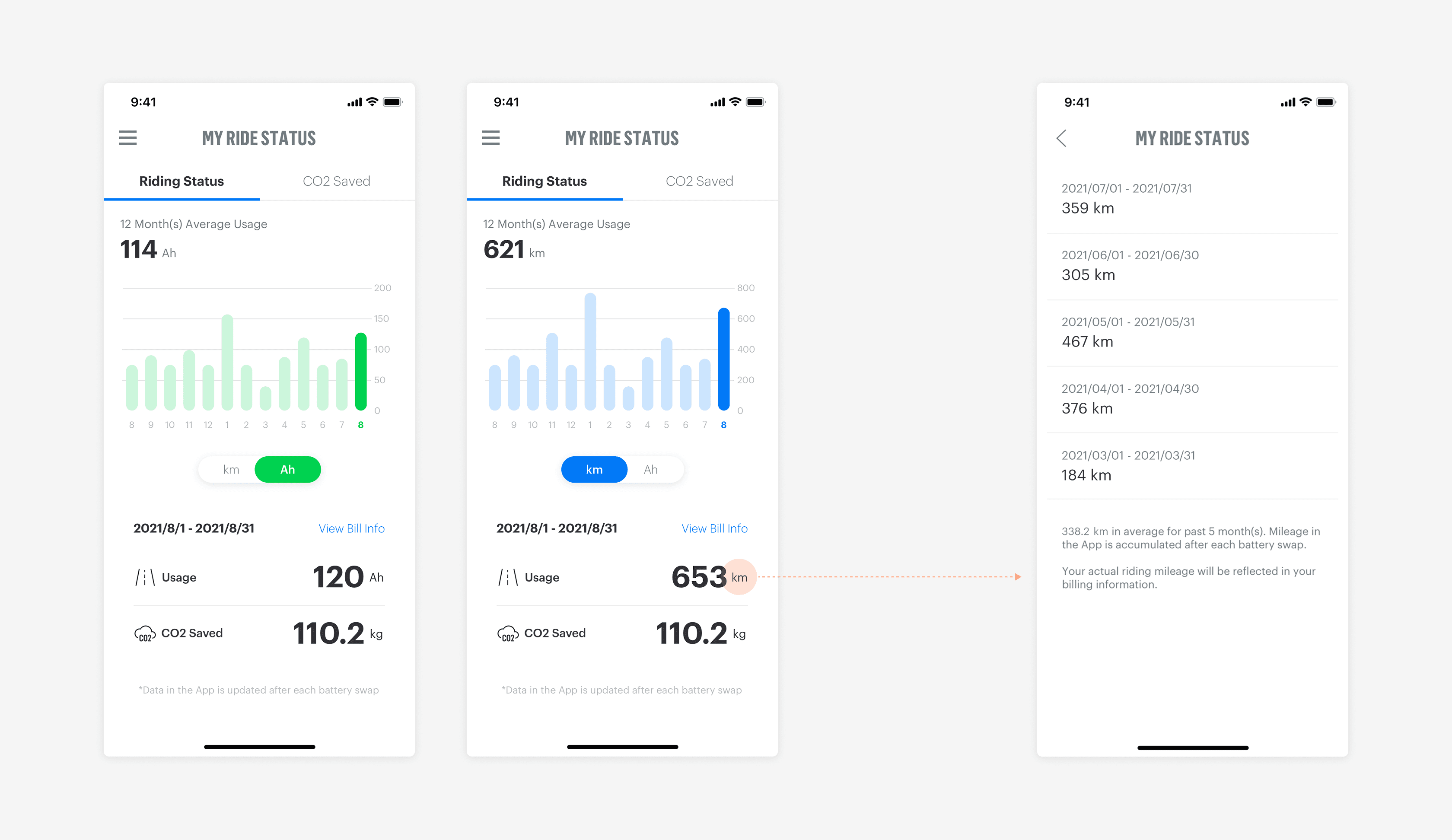
The redesigned My Riding Status addresses key issues from the previous version—namely, low readability and redundant content. Upon entry, the page displays energy usage from the past 12 months using the unit that matches the user’s subscription plan, helping them reflect on changes in their riding behaviour. The lower section highlights current-month stats, offering a quick snapshot of plan usage, contract cycle, and carbon reduction performance.

Responsive Graphs for Personalised Comparison
The redesigned bar chart is both interactive and adaptive. Tapping on a bar updates the lower section of the screen, showing Usage and CO₂ Saved data for the selected month.
To make comparisons easier, the Y-axis dynamically scales based on each rider’s mileage. For example, if the highest monthly usage is 800 KM, the graph shows intervals like 800, 600, 400—and expands accordingly for higher values to stay clear and relevant.
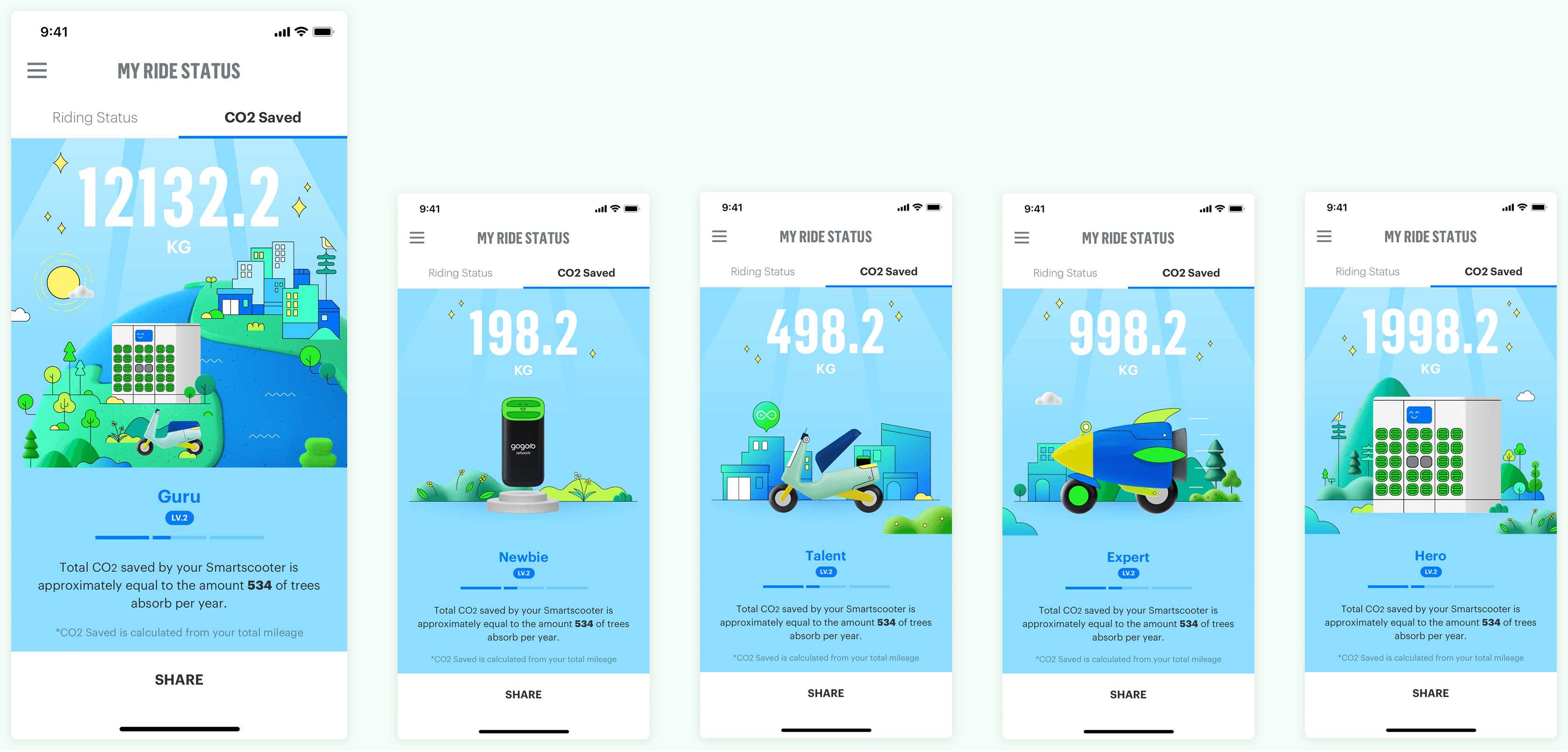
Gamified Carbon Tracking to Encourage Eco-Aware Riding
The redesigned CO₂ Saved page helps users better understand their environmental impact by converting carbon savings into more tangible equivalents, like the number of trees absorbed. To make progress feel more engaging, we introduced five achievement ranks with unique illustrations and titles. Each ride contributes to a progress bar, encouraging users to build lasting habits around electric riding.

Instant Achievement Notifications to Boost Engagement
When a user reaches a new rank or levels up within CO₂ Saved, an achievement card appears on the app’s home screen to highlight their progress. Users can tap to view more details, or share the card on social media and rider forums—celebrating milestones while strengthening community engagement.