Overview
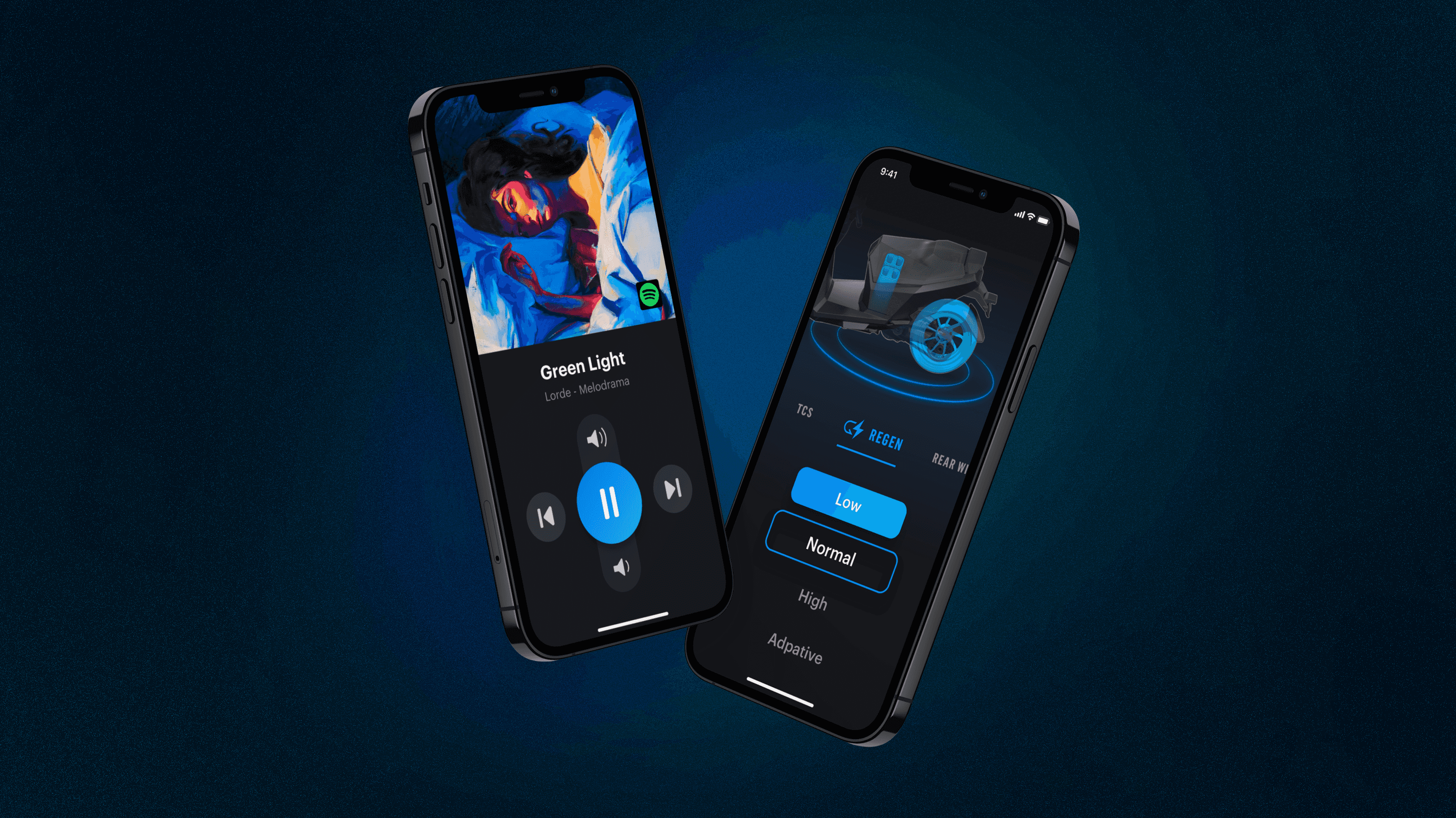
This project is geared towards exploring the potential of an interactive application between the mobile interface and the dashboard, expecting to break the interface and device limitations of traditional motorcycle dashboards and push the riding experience toward a more intelligent and innovative direction in the future.
Following the senior UI designer's establishment of the visual style, I collaborated closely on refining the user interface design. My responsibilities included designing features of music, settings, and weather. In addition, I worked alongside two senior UX designers, a product manager, and three senior engineers on the correctness and fluency of the interface demo.
My Role
Product Design, UI/UX Design, Prototyping and Testing
Challenge
To break out the existing form and limitations in current scooter dashboard displays and explore using smartphones as a dashboard.
In Taiwan's second-wheel market, scooter dashboard displays generally come in mechanical and LCD screens. However, each type has its limitations. Mechanical displays can't show too much information, while LCD screens are prone to fading over time due to environmental factors. Furthermore, riders often face operational complexity and higher costs when seeking additional functions like navigation and music via mobile apps or accessories.
Thus, this conceptual interface design project was proposed to explore using smartphones as versatile tools, serving as car keys, dashboards, and intelligent driving assistants.
UX Study
Users may control the interface while riding. One key task in the design was to find ways of keeping the users informed about where they are in the navigation and what options are available for easy control.
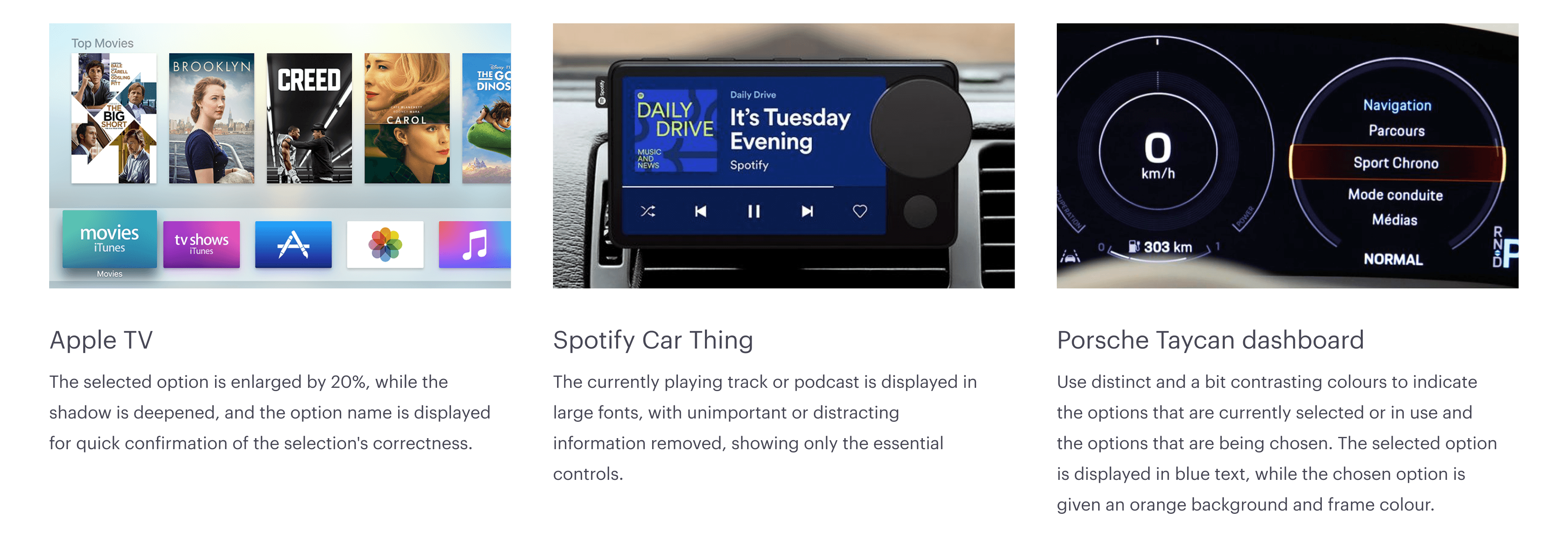
To achieve this, the team and I studied the interaction principles across various interfaces, ranging from smart TVs and car infotainment systems to digital dashboards. By closely examining the user experiences of Apple TV, Spotify Car Thing, and the dashboard on the Porsche Taycan, we summarised the advantages of each mode, which were used as references in the facilitation of developing a more comprehensive concept.
Principle
Then, the team formulated three design principles to serve as imperative rules and guidelines for this interface design process.
Clear — never getting lost
Usability First — easy to control with accessories
Keep Simple — fewer clicks are better
User Interface
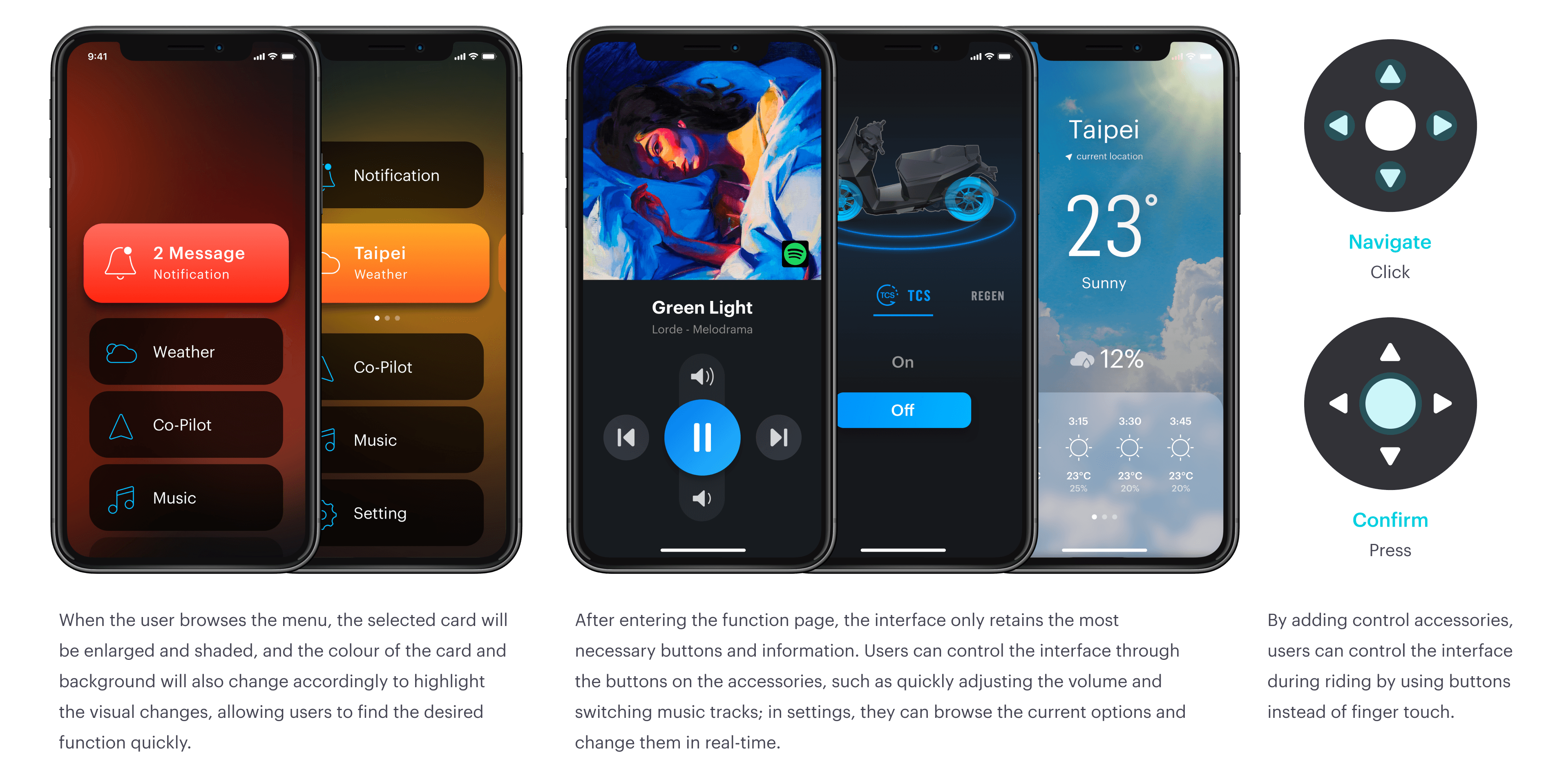
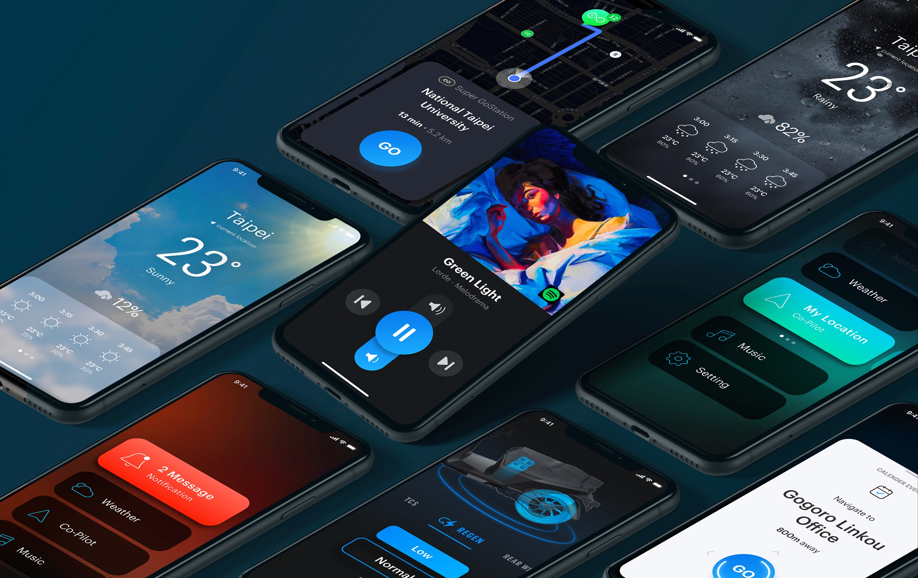
Drawing from the insights gained from the UX study, we crafted the following concept screen, with focus selection and noticeable colour as the main elements of interface design. We envisioned that by mounting their mobile phone on the dashboard, riders could access this feature, switch themes and view more detailed riding information directly on their devices. Moreover, adding control accessories allows riders to smoothly navigate through various functions while on the move, including navigation, weather, music, vehicle settings and tuning, information centre, games, etc.


