Overview
This project focuses on creating a new interface for the Gogoro App, enabling users to effortlessly control their vehicles and access real-time information on scooter status, maintenance services, riding habits, and more. The ultimate goal is to optimise the app's usability, interface, and intelligent experience.
I led the design of this project, including UI and interaction design for iOS and Android platforms. I collaborated alongside a senior UX designer and three product managers. In the development phase, I worked closely with engineers on detail adjustments and issues verification. The new interface was launched alongside the Gogoro App's version update on January 4, 2022.
My Role
Product Design, UI/UX Design, Interaction design, Information Architecture, Prototyping and Testing, Design System
Challenge
To address the fragmented user experience caused by scattered functions and info within the Gogoro App.
The Gogoro App offers scooter owners a range of functionalities, including vehicle control, customisation options, instant information access and so on. However, these features were scattered across different pages, making it troublesome for users to find what they wanted and control all vehicle-related situations simultaneously.
Therefore, the primary purpose of this project was to introduce a new control page called the "iQ page," which integrates existing functions and control buttons, providing scooter owners with a centralised hub to manage their vehicles in one place.
Goals
Our goal for this project was to build a solid foundation for the upcoming interface revamping of the Gogoro App, optimise the user experiences and embrace a more diverse user base.
Our higher ambitions were to:
Make the app fast and easy to use for scooter owners anywhere, anytime.
Give riders more control over the energy usage.
Have better customer engagement and customer loyalty.
Revamp the Gogoro App to serve business requirements and fulfil continuous innovation needs.
Information Architecture
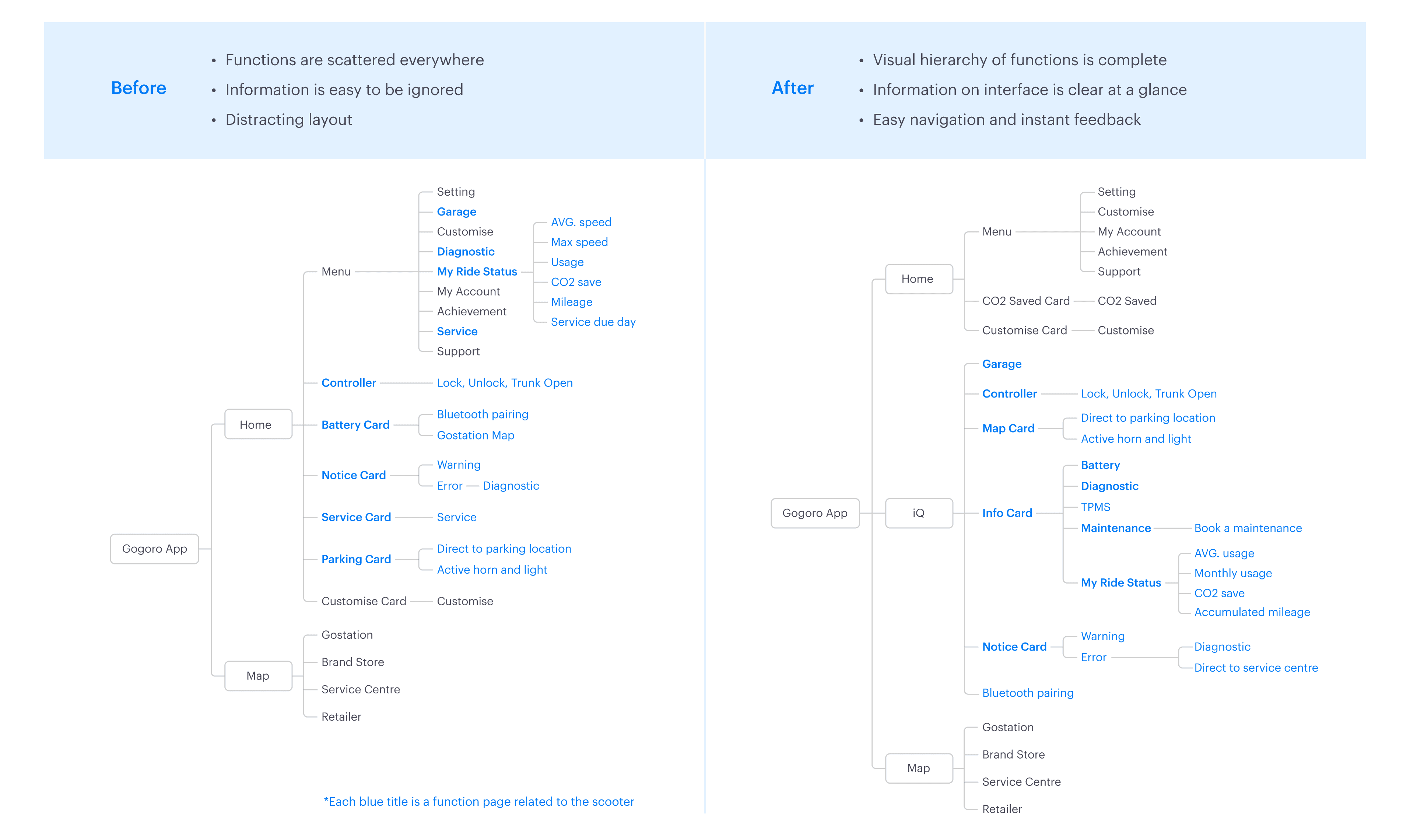
I worked with product managers and UX designers to review the existing information architecture, take inventory of scattered vehicle-related functions, categorise them according to their importance to users or the frequency of use, and then create the iQ page based on the findings. Details are shown in the comparison chart below:
Competitive Analysis
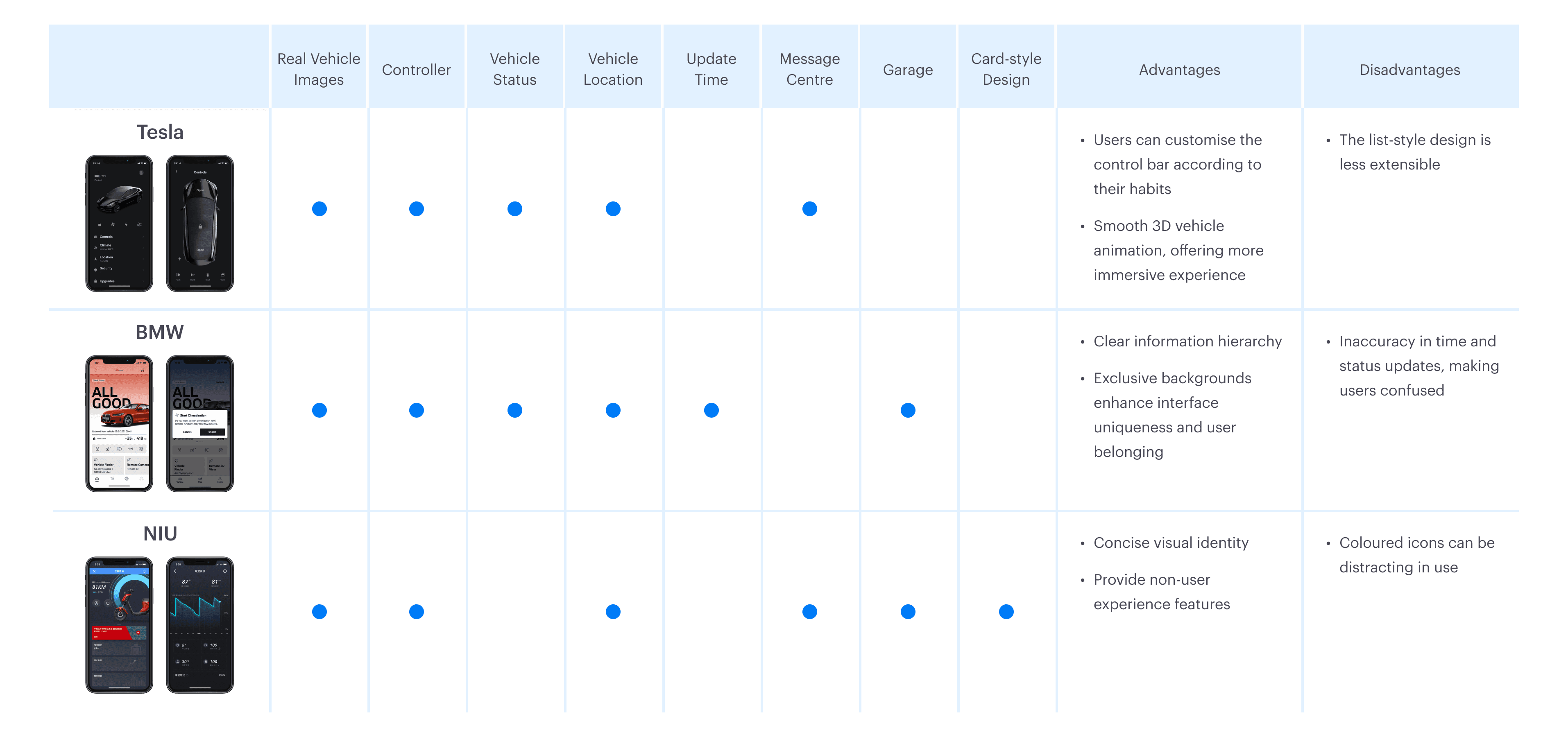
By analysing interface features, advantages, and disadvantages of competitor products, we strategically determined the design direction for the iQ page. This analysis allowed us to identify essential UI improvement and innovation areas and envision future extensibility in functions and design systems.
Concept Generation
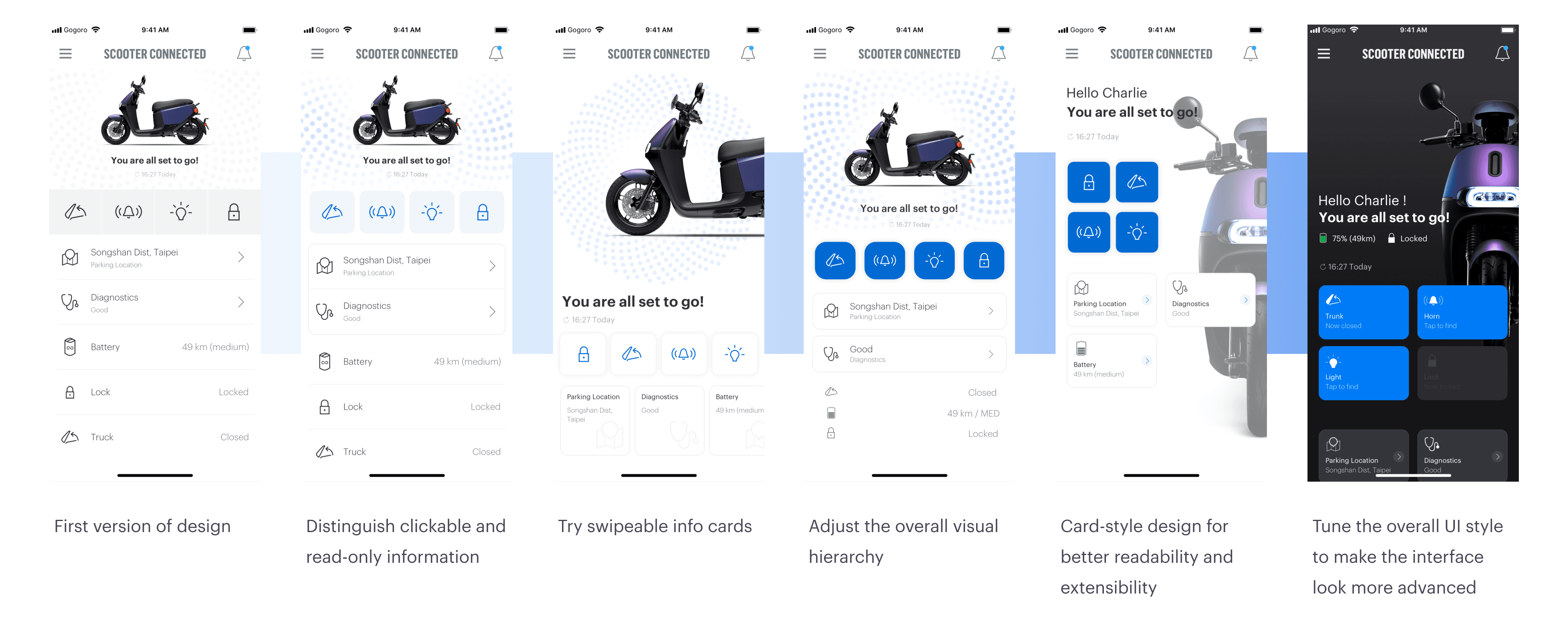
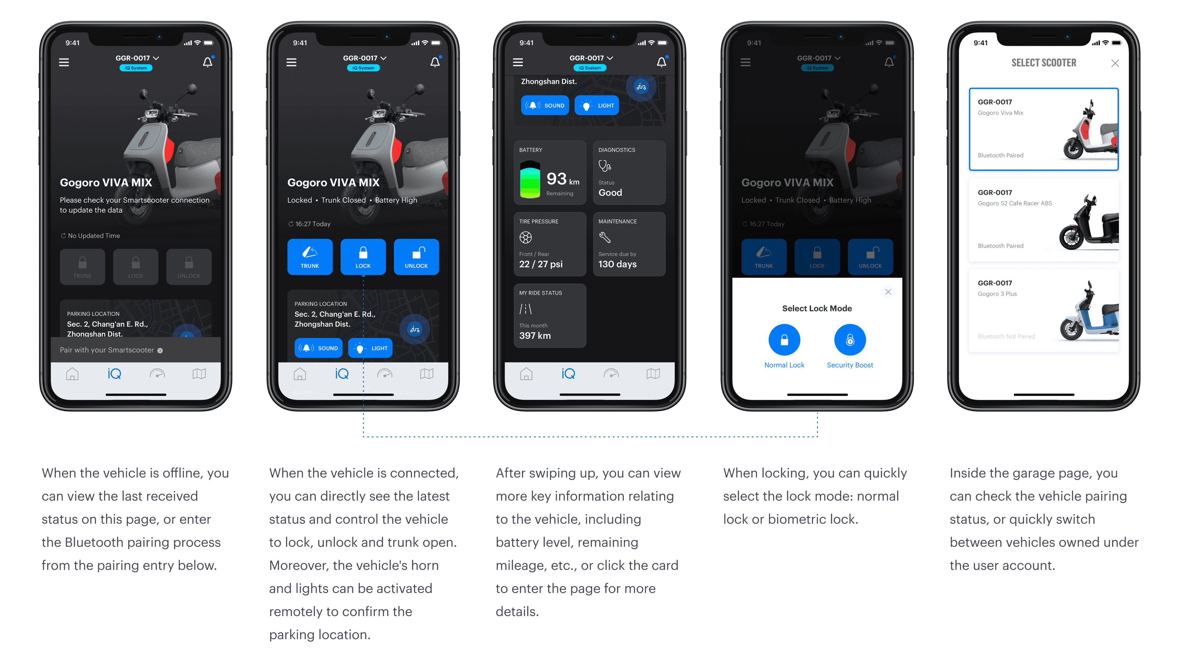
After confirming the design focus, the team and I started prioritising the information to be presented first to scooter owners. We used the most important information for users, including vehicle battery status, lock status, and commonly used controls (lights, horns, trunk open) as the core functions of the control page. Additionally, we ensured that matching different vehicle models as backgrounds was possible, allowing users to confirm promptly whether the selected vehicle was correct. Then, I started with the design of this control page, exploring and ideating different UI styles.
User Interface
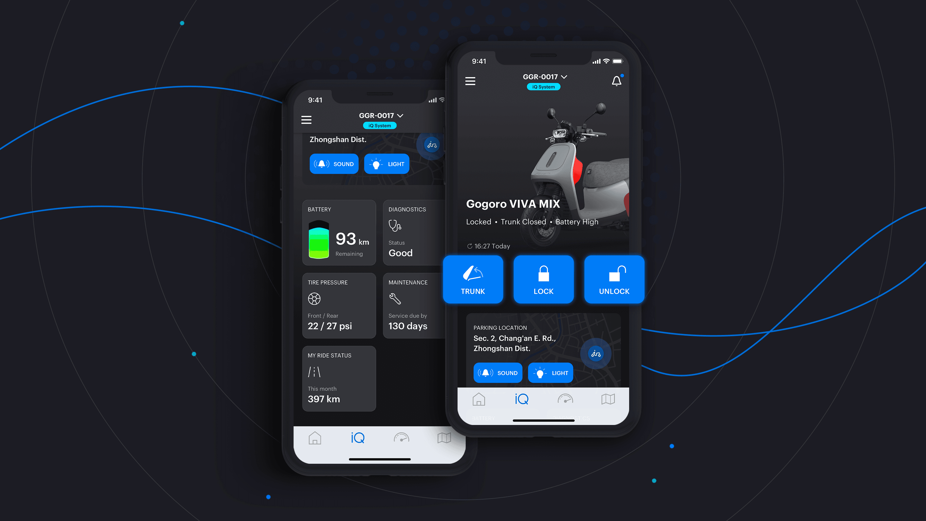
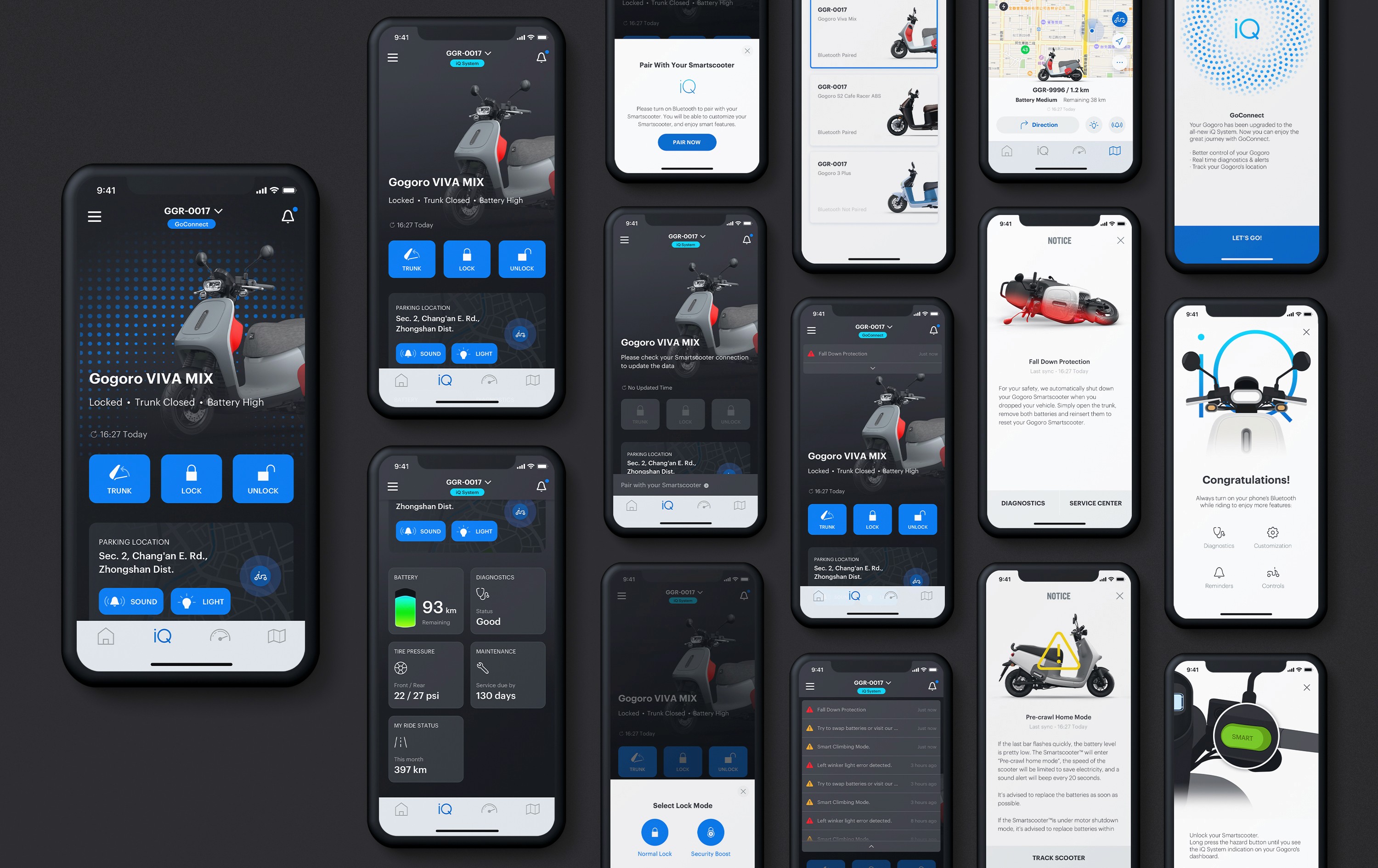
The team ended up choosing the grey-black gradient background for the control page, complemented with a 45-degree actual vehicle photo to showcase the features and colours of different vehicle models. Given the need to serve dynamic content and various information for different models, we prioritised modularity in the UI elements. So, I used the card view design as the core experience in this interface.
Then, after establishing the style, I fine-tuned the visual hierarchy based on the information architecture and standardised the use of card modules and icons, enabling the design to adapt to different types of content and needs and giving a coherent user experience.
