Overview
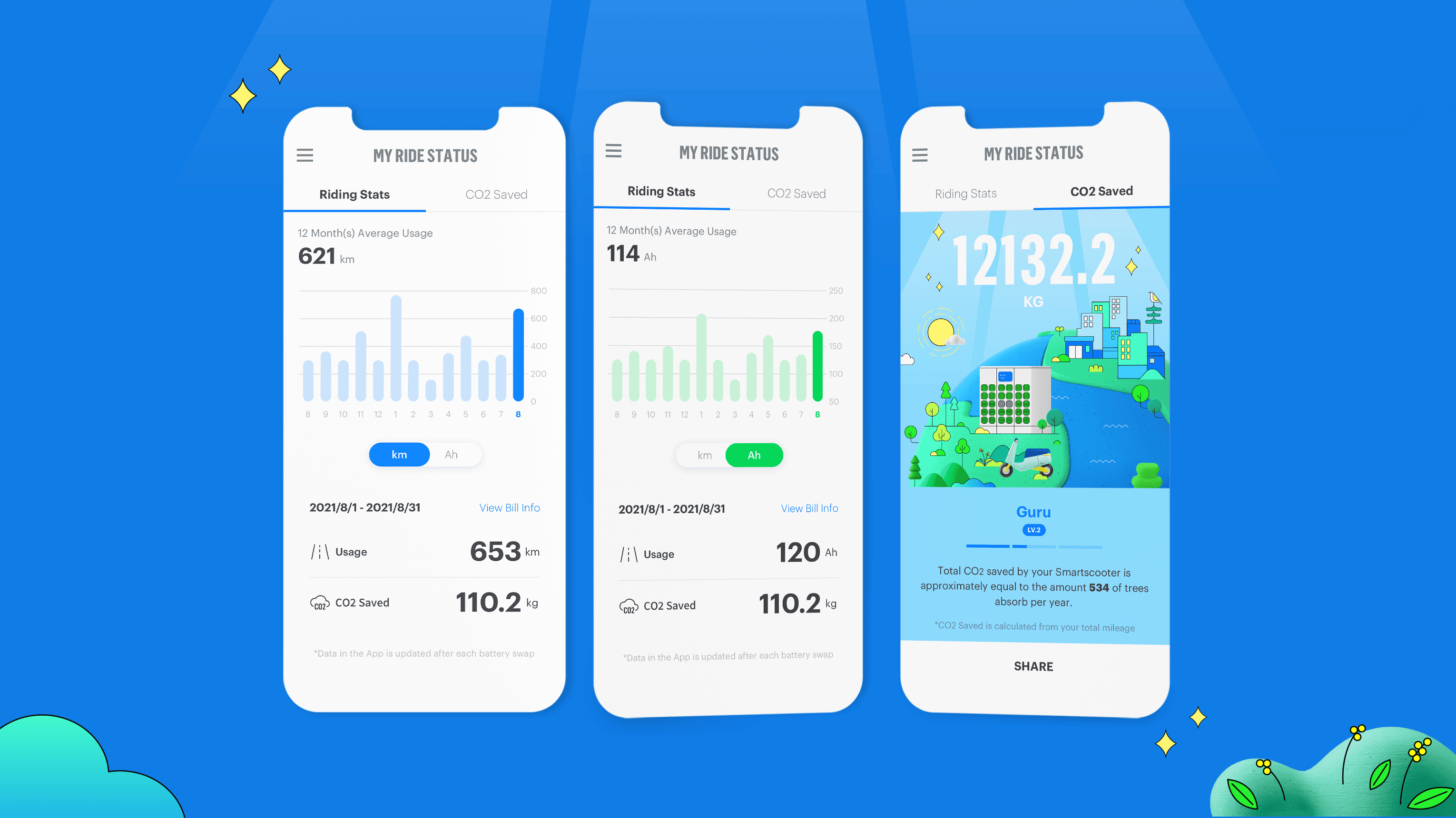
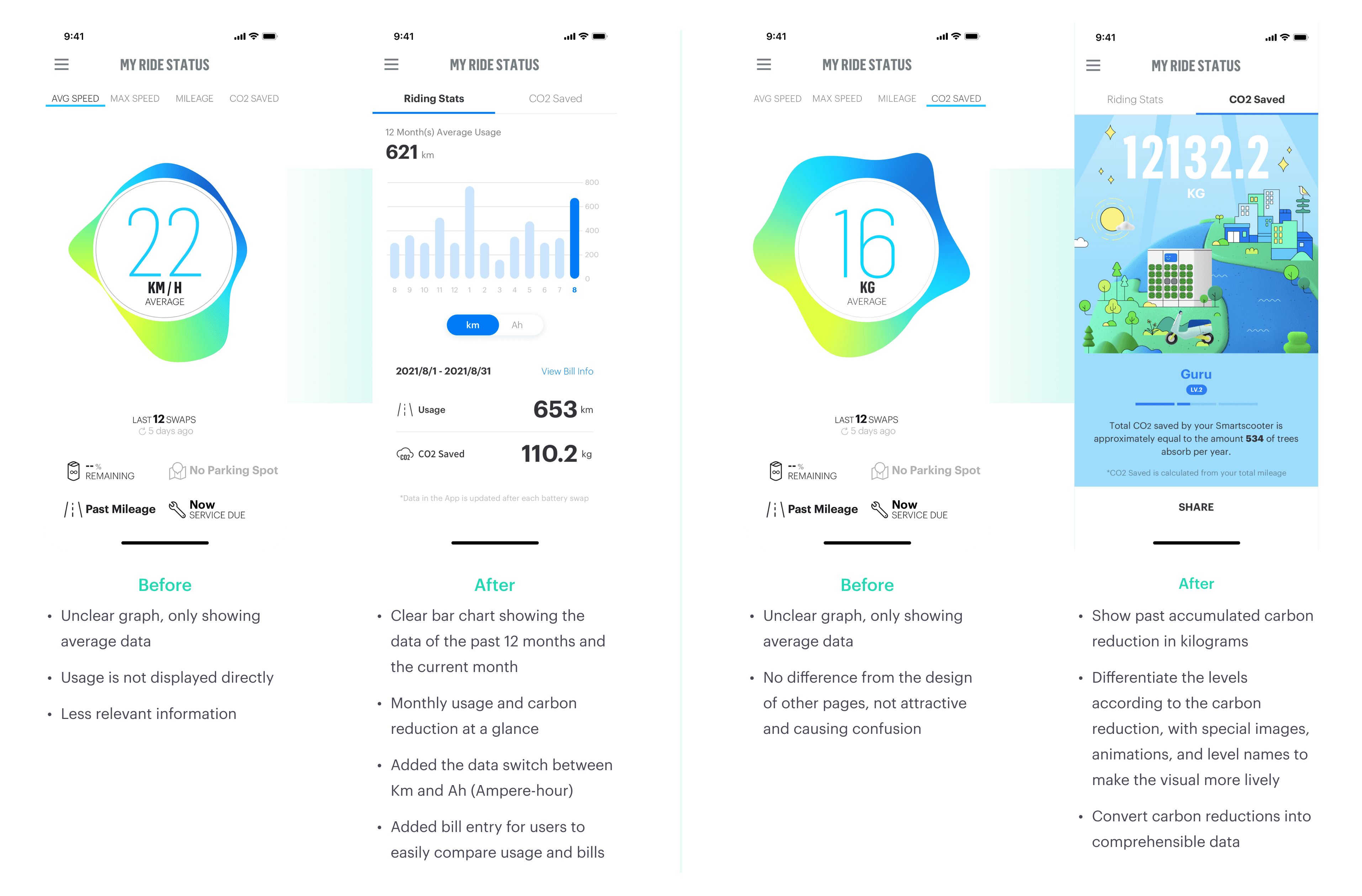
This project aims to revamp the original interface to address the graphs and information displayed that users do not comprehend, increase readability, and provide users with more comprehensive riding details and records for habit referencing, behaviour education, and achievement sharing.
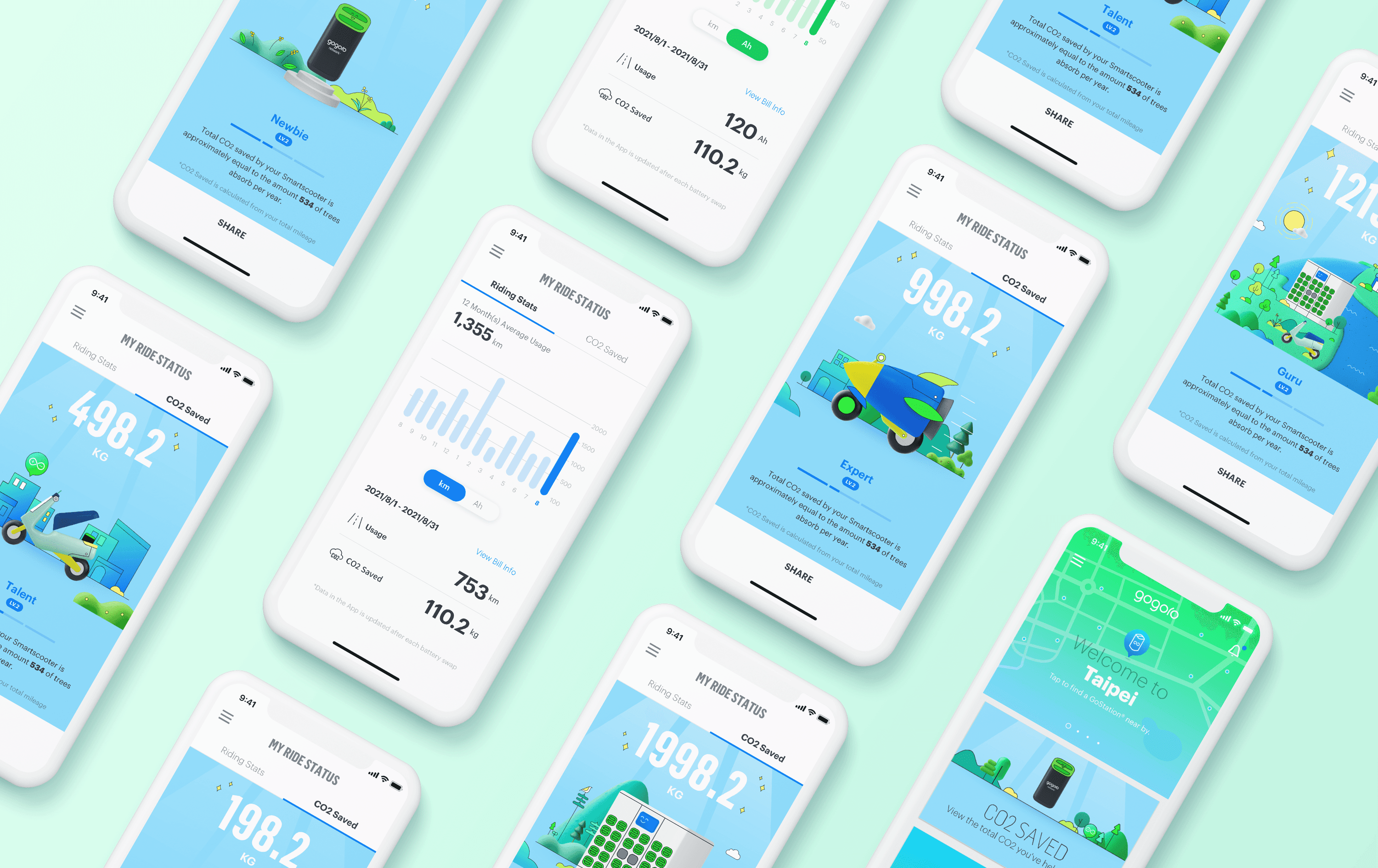
In my role as a UI designer, I focused on designing a clear and understandable interface for data presentation. I also redesigned the background and notification cards for each carbon reduction level, which appreciate users’ contribution to a sustainable future and give them a sense of accomplishment.
My Role
Product Design, UI/UX Design, Visual Design, Prototyping and Testing
Challenge
To tackle user confusion with the original interface and enhance the readability of the riding-related data.
My Ride Status page in the Gogoro App is an essential tool for users to learn about their riding-related records and usage data.
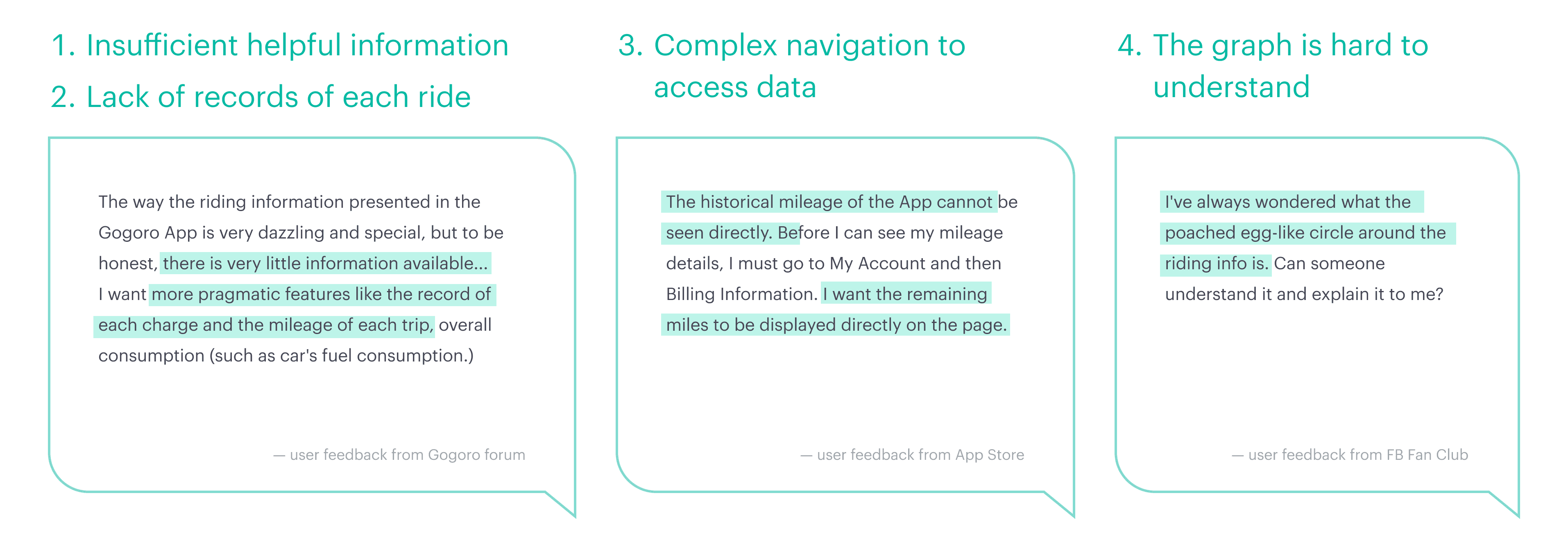
Based on numerous user feedback and online comments, the original design was not user-friendly and did not offer enough valuable information. Recognising the lack of clarity and insufficient communication of details, it was clear that a redesign of the interface was necessary.
Discovery
In order to ensure that app updates meet user needs, the design and product teams regularly review collected user feedback in our weekly meetings. Since introducing this feature page in 2017, we have noticed a gradual rise in negative feedback across social platforms, with users consistently highlighting following four pain points. Therefore, we have taken these issues as the focus of this interface improvement.
Design Iteration
The redesigned interface features two main sections: Riding Status and CO2 Saved. Riding Status offers users detailed information on their rides and subscription plans, such as accumulated mileage, consumption efficiency, and current usage. Meanwhile, CO2 Saved presents users with a summary of their carbon-saving efforts through illustrations and conversion data.
This enhanced interface allows users to understand better how their riding habits impact energy networks and monthly usage. Ultimately, the goal is to inspire users to adopt positive behavioural changes, contributing to a sustainable future.


